How Gold as Currency reshaped Walgold’s home, gave its growing services a clearer structure, and brought an existing transfer feature into focus.
Business strategy → Product experienceA Walgold case study · 10 min read
Scope Home, hub + transactionsDirection Gold as CurrencyPrinciple Simplicity
+80%Average gold transfer activity after the redesign
ExistingA transfer capability given greater visibility
ScalableA feature hub designed for the product’s growth
The starting point
A new role for gold.
Walgold’s redesign began with a change in business strategy. We wanted to move from a platform for buying gold toward Gold as Currency: an experience where people could hold gold, move it between one another, and eventually use it in more of their financial lives.
That shift changed the design brief. We needed an interface that made gold feel like an available balance, with useful actions around it. Banking apps gave us a familiar language for that relationship. Simplicity became the principle for deciding what people should see first and how they should move through the product.
The result was a home organized around the account, a scalable hub for features, and more focused transaction flows. Our first step toward the broader ambition was concrete: give an existing capability—gold transfer—a more prominent place.
01 · Strategy into design
Design for what happens after the purchase.
Buying gold was already central to Walgold. Gold as Currency expanded the question: once people owned gold, what could they do with it?
Transfer was already available. Gifting appeared in our early explorations. We also had to consider a future in which Walgold might offer a bank card for spending gold. Together, these possibilities pointed toward a product with an ongoing role in someone’s financial life.
This made the banking reference useful at a structural level. A balance, the actions attached to it, and a clear way to find services could help people understand gold as something they could use. The interface also needed room for capabilities beyond the ones available at the time.
The strategic ambition shaped both the product’s mental model and the structure that would support its growth.
From a strategic ambition to a design direction.
The central shift
Starting pointA place to buy gold.
The purchase as a defining moment in the experience.
→
Strategic directionGold as Currency.
A broader role for gold in a person’s financial life.
Product roleMake holding and moving gold part of one account experience.
Design languageUse banking familiarity to make available actions recognizable.
Experience principleKeep the home focused and give growing services a dedicated hub.
A summary of the design rationale. Gold as Currency describes the strategic direction.02 · Making the direction tangible
Bring an account-first experience into the review.
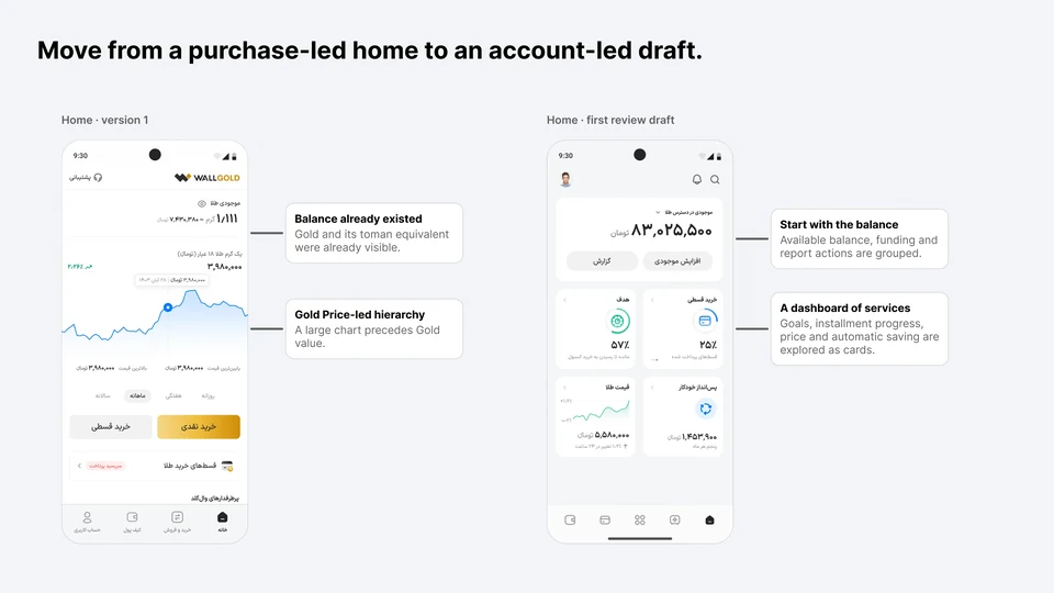
The original home already showed the gold balance and its toman equivalent. Below it, a large price chart led into cash and installment buying, followed by physical gold products and delivery. Its hierarchy emphasized acquiring gold.
Our first draft explored a different emphasis. Available balance, funding, and reporting were grouped together. Goals, installment progress, price information, and automatic saving appeared as service cards.
We brought this draft to the design review meeting to discuss the implications of the new strategy. The screens made an abstract ambition easier to evaluate: could this feel like an account people would return to and use?
Move from a purchase-led home to an account-led draft.
References 01–02. The original home and an early concept prepared for design review.03 · Refining the home
Make the balance the starting point.
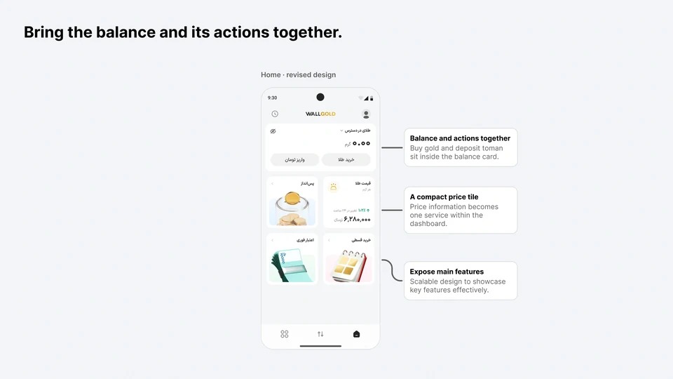
The revised home brought the gold balance together with Buy gold and Deposit toman inside the main card. The account and its immediate actions could be read as one group.
Price remained visible as a compact tile alongside savings, installment purchase, and credit. This reduced the dominance of market information and gave other financial activities a place in the experience.
Our working rule was simple: help people understand their account, then help them choose an action. Simplicity came from the hierarchy and grouping of information.
Bring the balance and its actions together.
Reference 03. The revised home brings the balance, immediate actions and key services into a shared structure.04 · Room for the product to grow
Give every feature a home, without crowding the home.
The broader strategy created a practical design problem. As Walgold’s capabilities expanded, putting every service on the home would make the account harder to read.
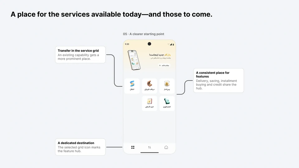
We designed a scalable feature hub: a dedicated place to discover the product’s services. The home could stay focused on the account, while the hub gave all features a consistent place in the navigation. New capabilities could join this structure as the product evolved.
The hub also made the strategic direction visible through actions. Transfer appeared alongside services such as physical delivery, saving, installment buying, and toman credit. This showed a wider range of things people could do with Walgold.
A place for the services available today—and those to come.
Reference 04. A dedicated destination for services gives transfer greater visibility and supports future features.05 · Choosing the first step
Start with the capability people already had.
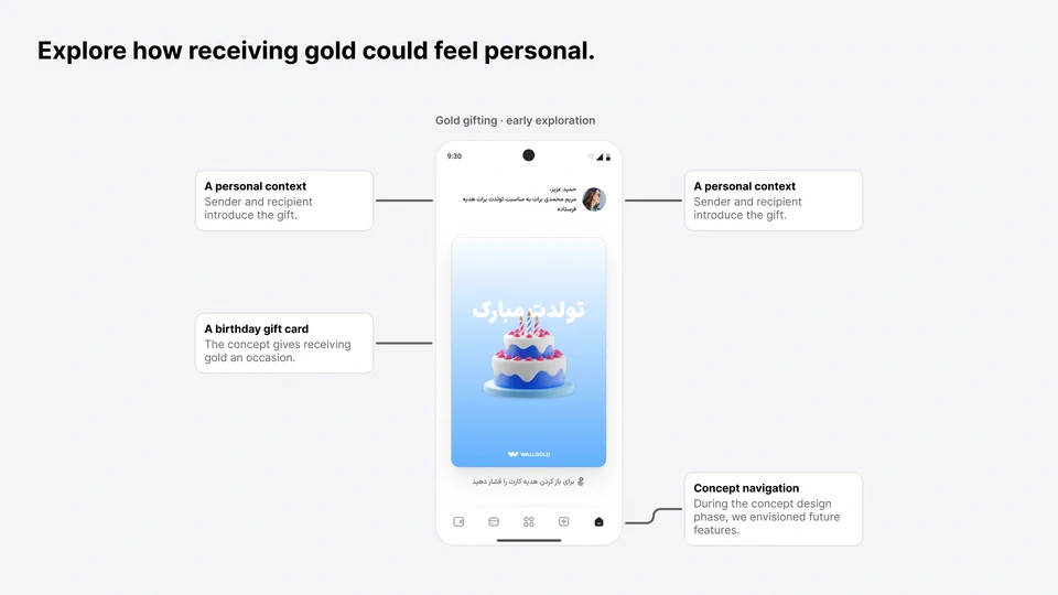
In the early drafts, we explored gifting gold as a way for it to move between people. A birthday gift card explored how receiving gold could feel personal.
For the first step, we made the existing transfer feature more prominent in the hub. This connected the long-term strategy to something people could already use. Giving transfer a clearer place inside a banking-like experience helped present it as a natural action to take with a balance.
We were also designing with a possible bank card in mind. If people could eventually spend gold through a card, the product would need a structure that could accommodate that service. The account and hub provided a direction for that future. Gifting and the card were possibilities considered in the design; the immediate step described here was greater visibility for transfer.
Explore how receiving gold could feel personal.
Reference 05. An early birthday-gift concept exploring a personal context for gold transfer and possible future features.06 · Adapting to user needs
Let the tiles reflect the state of each service.
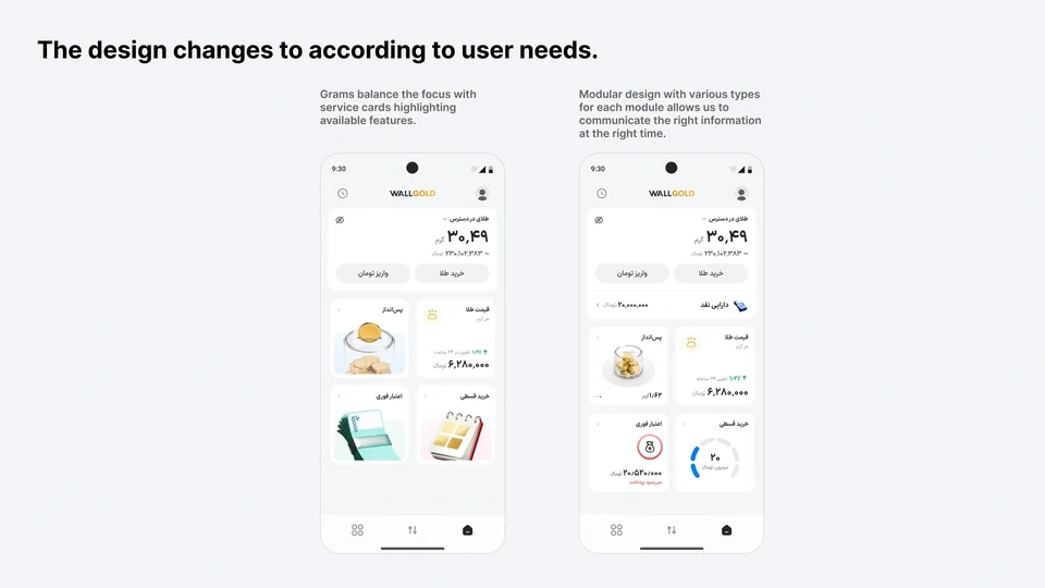
We designed the home around modular tiles whose shape and content could change with the user’s needs and the state of each service. Illustrated tiles introduced the available features. When a service was in use, its module could give more space to the information needed to keep track of it.
A savings tile could show the amount saved. Credit could surface a payment due date and the next action, while an installment tile could show repayment progress. A cash-balance row could also appear below the main account card. The modules changed their layout and emphasis to fit the information they carried.
The gold balance remained the starting point in both states. This gave the home a consistent structure while supporting two needs: discovering what Walgold offered and managing services already in use. It extended our simplicity principle into the tile system—show the information that matters for the current situation.
The design adapts to user needs.
Reference 06. The same modular home supports service discovery and active use. Tile shape and content change to show the information relevant to each state.
How the strategy shaped the design.
Strategic need
Design response
Gold with an ongoing role
An account-first home, with the balance and its actions grouped together.
A broader set of services
A scalable hub that gives all features a place while keeping the home focused.
Gold moving between people
Greater visibility for existing transfer, informed by the early gifting direction.
A simple financial experience
Familiar banking patterns, focused amount entry, and a clear purchase review.
07 · Carrying the principle into transactions
Focus on one amount at a time.
Buying and selling remained core actions. Their redesign carried the same emphasis on familiar, straightforward financial interactions.
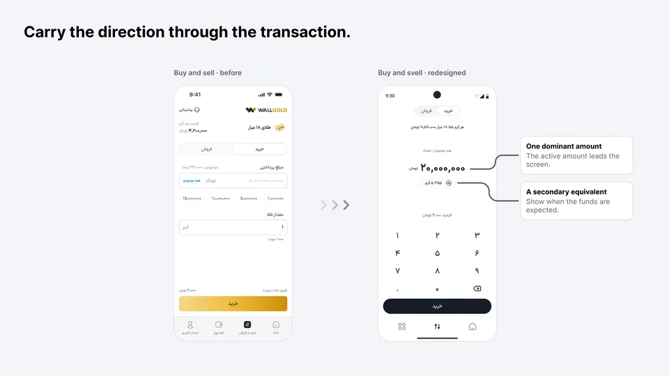
The previous entry screen used two boxed fields for toman and grams, with preset amount choices. The redesign gave one active amount the strongest visual focus and placed its converted equivalent in a smaller secondary element. A dedicated numeric keypad occupied the lower part of the screen.
The sequence was easy to read: enter an amount, understand its equivalent, and continue. Both versions still included entry and confirmation; we focused on the clarity and emphasis within those stages.
Carry the direction through the transaction.
References 07–08. Amount entry before and after the redesign: the main amount leads, with the converted equivalent kept nearby.
Give payment review its own space.
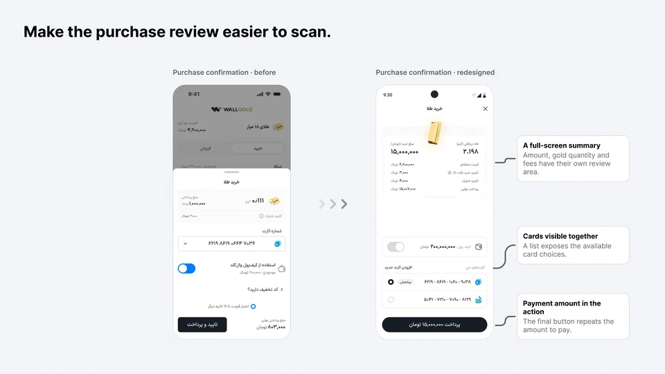
In the earlier purchase flow, confirmation appeared in a bottom sheet with a card dropdown and a separate wallet-payment toggle. The revised purchase confirmation used a full screen: the transaction summary at the top, bank cards listed below, and the amount repeated in the final payment action.
This made card selection visible within the review screen. The selling designs retained a bottom-sheet confirmation; the full-screen change shown here belongs specifically to buying.
Make the purchase review easier to scan.
References 07–08. Purchase confirmation moves from a bottom sheet to a dedicated review screen with payment choices visible together.08 · What changed in use
Average gold transfer activity grew by 80%.
After the redesign, average gold transfer activity increased by 80%, while purchase activity remained unchanged. Transfer was an existing capability, so the increase reflected greater use of something the product already supported.
We interpreted this as a response to the combination of a more familiar banking-like experience and greater visibility for transfer in the hub. It was an encouraging signal for Gold as Currency: the capability that allowed gold to move between people saw greater use within the changed experience.
Monitoring online feedback also surfaced positive comments about simplicity and satisfaction. These were qualitative signals from the conversations we observed, rather than a formal satisfaction score.
The outcome sharpened our definition of success. A strategy built around using gold needed evidence of use beyond buying; purchase growth alone would have missed the clearest change in behavior.
Three signals from the changed experience.
Observed outcomes
Average gold transfer activity+80%
Reported increase after the redesign, with an existing feature made more prominent in the hub.
Purchase activityUnchanged
Buying showed no corresponding change.
Online feedbackPositive signals
Qualitative feedback about simplicity and satisfaction.
These observations followed the redesign; the design’s contribution was not isolated. Online feedback is qualitative, not a formal satisfaction score.
Transfer activity was the outcome most closely aligned with the new strategic direction.What we took from the work
A new strategy can change the meaning of an existing feature.
Gold as Currency gave us a reason to rethink Walgold’s hierarchy, navigation, and transaction patterns together. The account-first home established the relationship, the hub made services discoverable, modular tiles reflected the state of each service, and simpler flows carried that direction through individual actions.
Transfer made the connection tangible. The capability already existed; giving it a clearer role in the product helped us take a first step toward the broader ambition. Gifting and a possible bank card shaped how far ahead the design needed to look.
The project also changed how we thought about success. As the intended role of gold expanded, we needed to look beyond purchases and examine the behaviors that made that role possible. The next question would be whether people returned to transfer gold again, and whether that use became part of a sustained habit.
The strategy changed how we presented the account—and the role an existing feature could play within it.
About the figures: original Persian Walgold designs are reproduced with English annotations. The annotated boards supplied for this case study replace the individual frame screenshots. UI amounts are design content, not performance metrics.